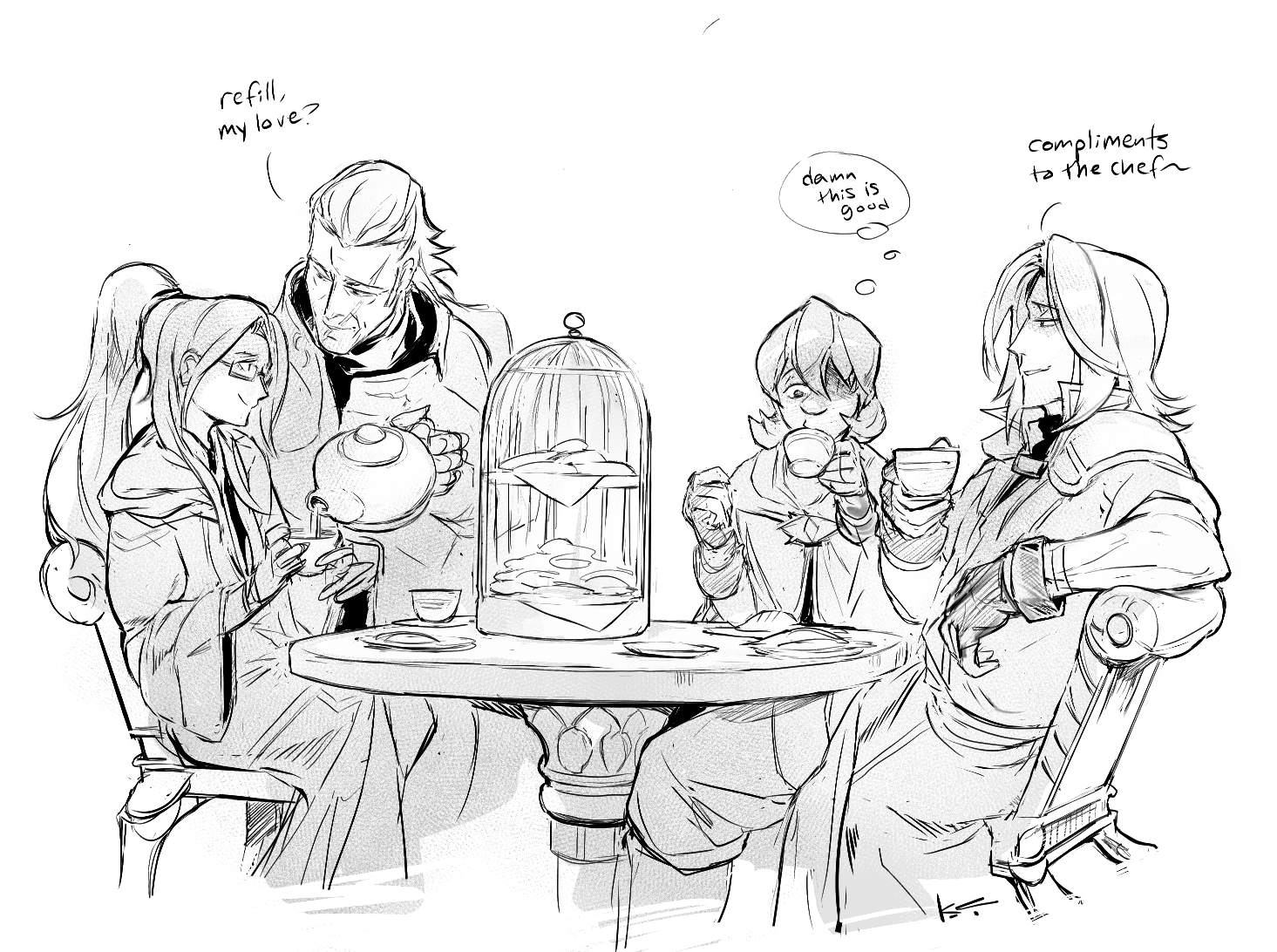
little holiday gift to lululeighsworld on tumblr of our summoners/us having a teatime double date with the FE husbands ~ 🙂
the refill line is actually an easter egg nod to their adorable fic here; felt apropos!
little holiday gift to lululeighsworld on tumblr of our summoners/us having a teatime double date with the FE husbands ~ 🙂
the refill line is actually an easter egg nod to their adorable fic here; felt apropos!
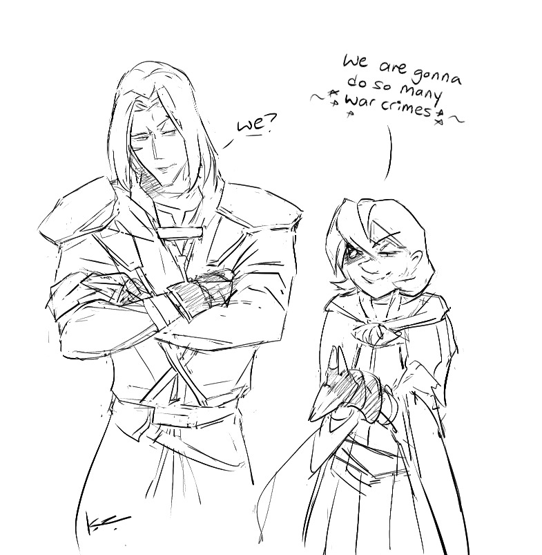
little doodle of zihark and my self insert/FEH summoner who i’ve been drawing since uhhh forever but forgot how to recently lol, since i want to do a Thing involving them but needed to practice.
this summoner’s entire shtick is if you basically dropped /r/ncd into a FE world. 😀 yee it’s a fun dynamic.
claw daddy…
[anakin padme meme] you’re drawing this new strip in a messy/quick style just to fart out this idea right.
……….right, krad?
bonus closeup:
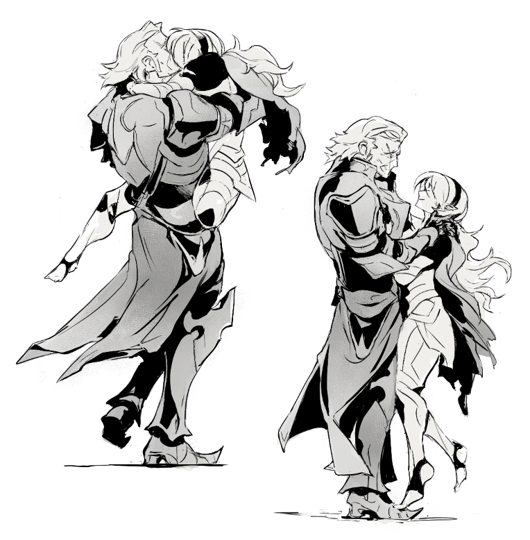
gunter/corrin, if their paired rev route had panned out. :’)
(part of a larger thing)
 nagamas gift to rarepairsmut on twitter, enjoy! 😀
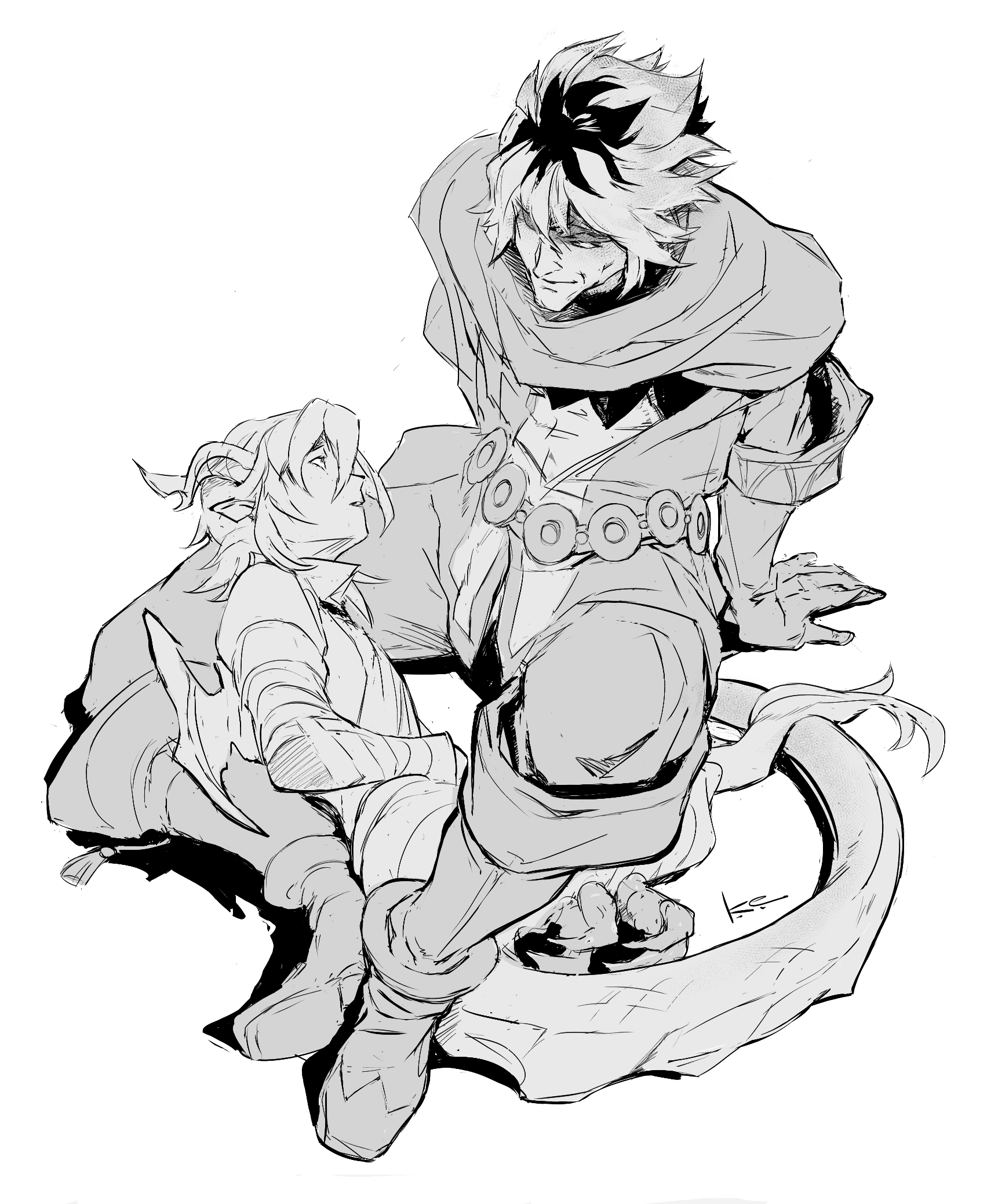
one of the ships was shura/corrin; i had been eying those two for a while so it was a delight to try my hand at them along with some added details ~ shura keeps appearing on my recent fates teams no matter what, he’s fun, heh.
nagamas gift to rarepairsmut on twitter, enjoy! 😀
one of the ships was shura/corrin; i had been eying those two for a while so it was a delight to try my hand at them along with some added details ~ shura keeps appearing on my recent fates teams no matter what, he’s fun, heh.
yet more! gunter/corrin
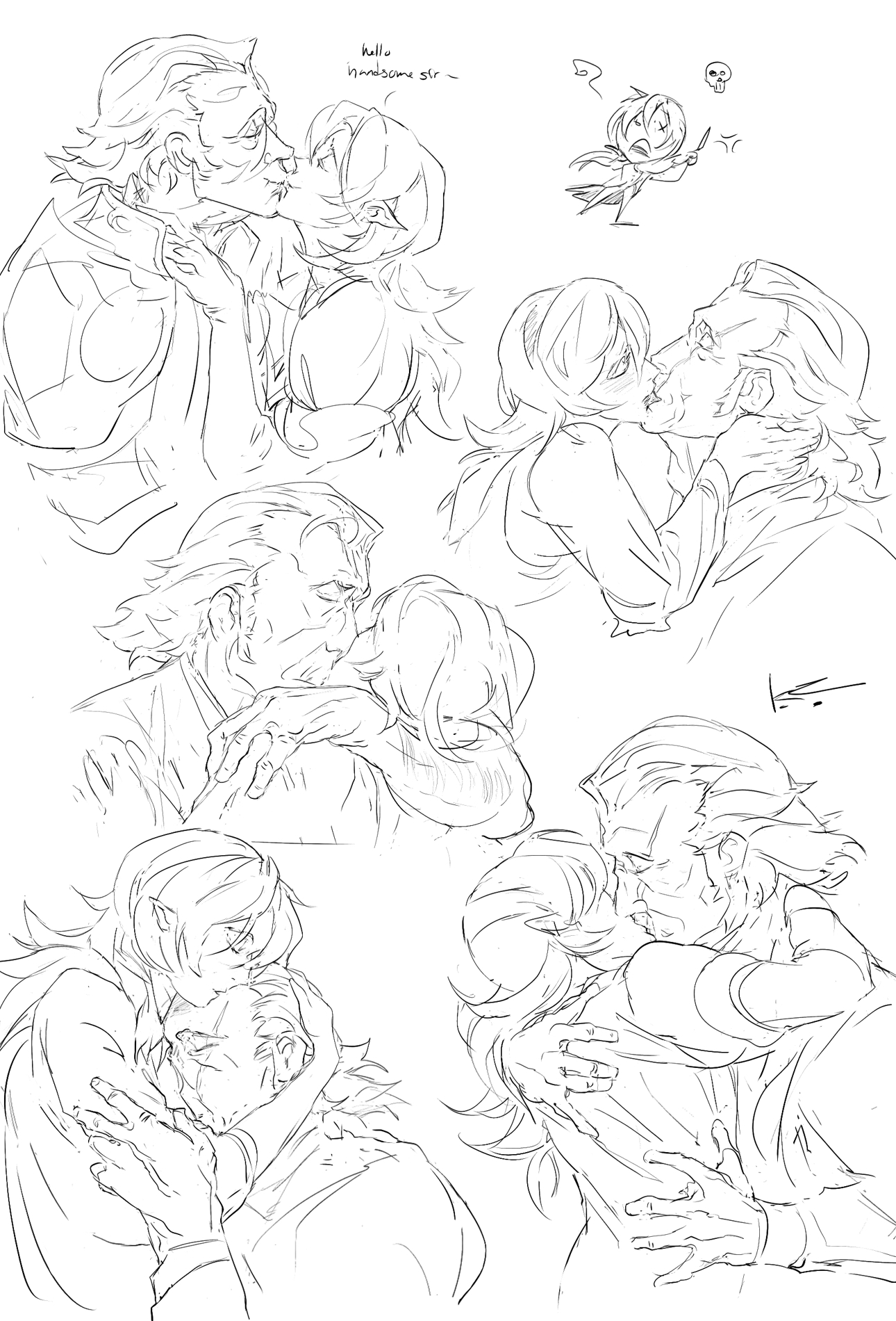
drawing smooching is hard, practicing loosely from peter cushing gifs ~
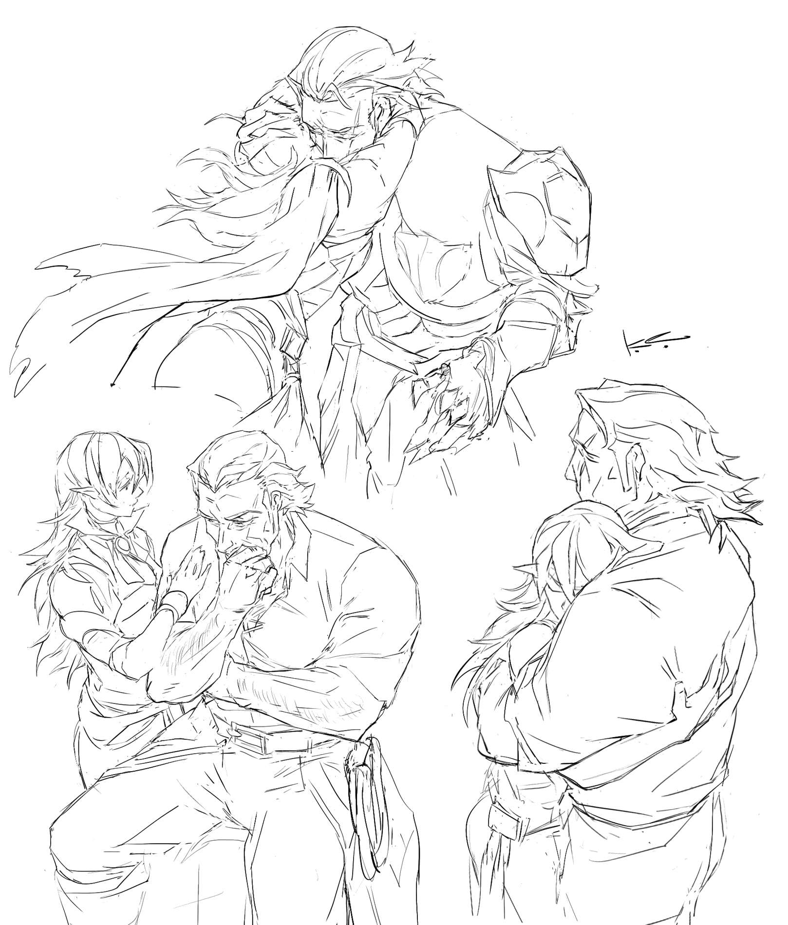
more gunter/corrin
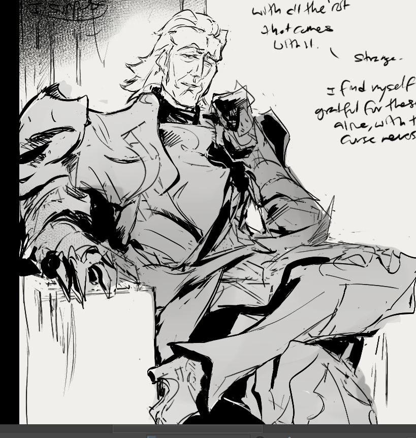
had feelings upon (re)recruiting him in the first playthrough proper on the 3DS ;___;
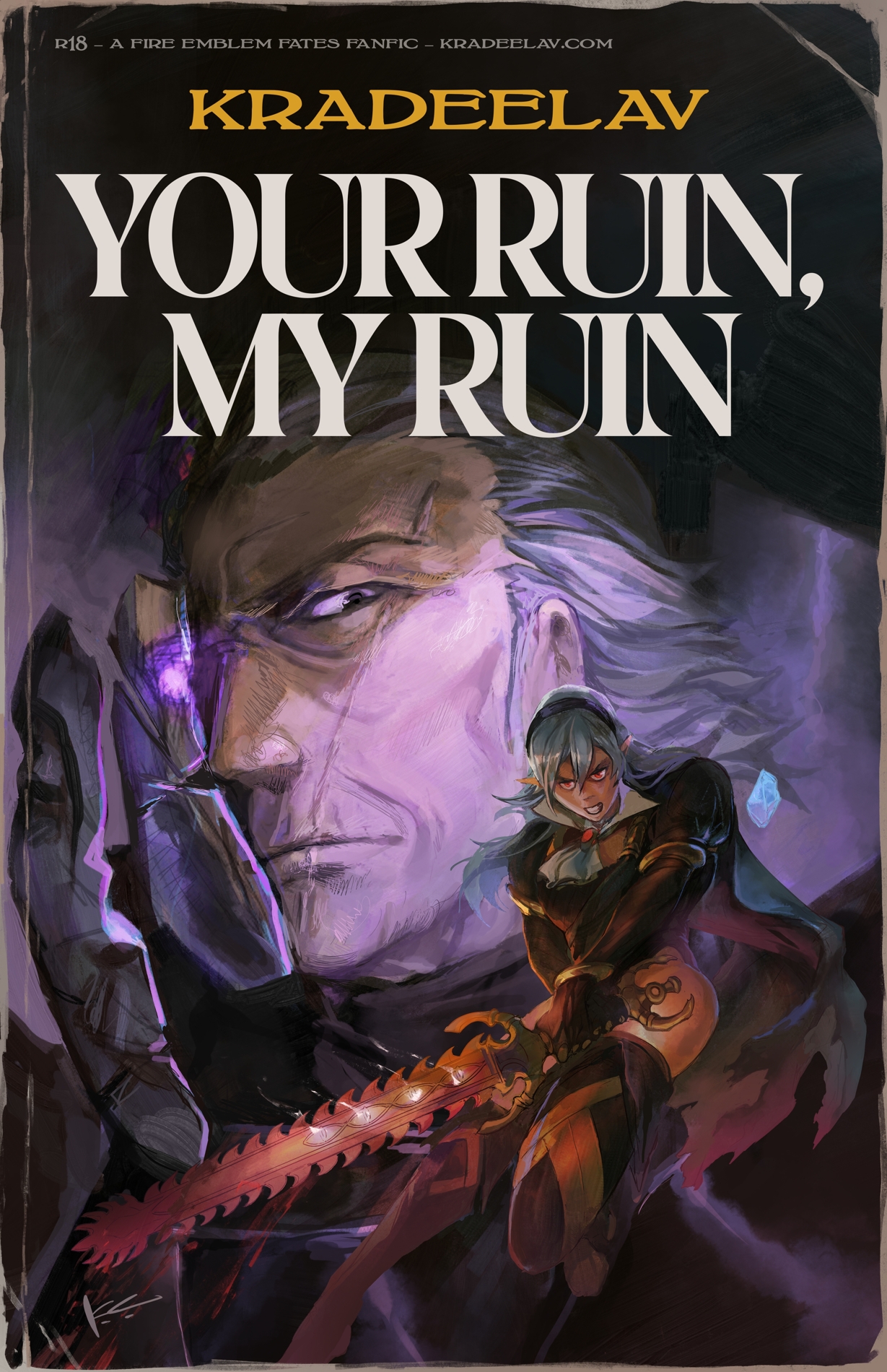
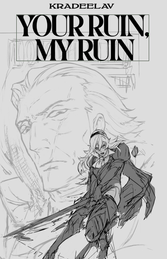
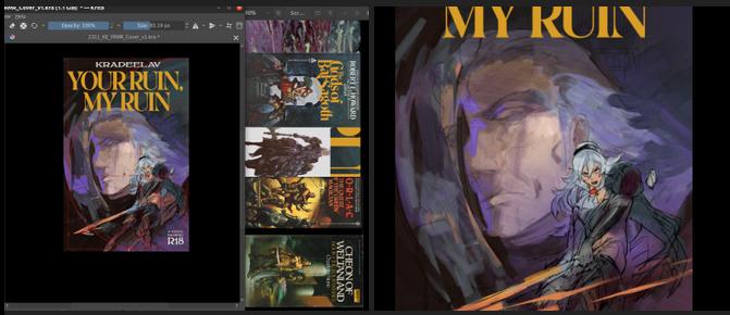
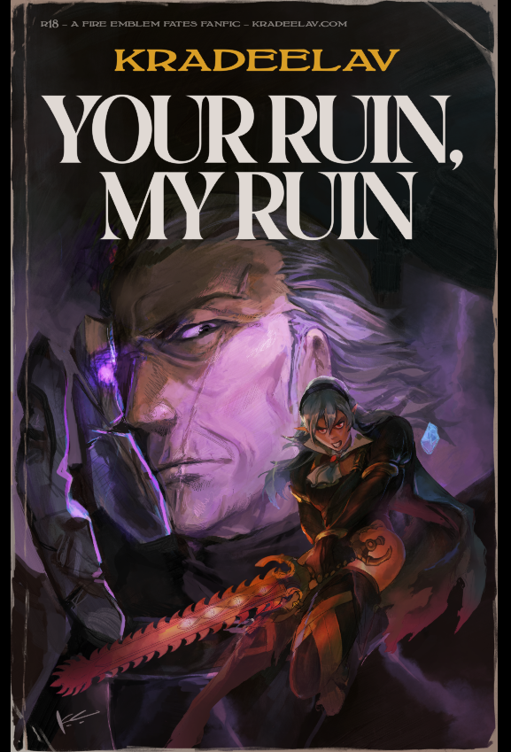
Final cover for your ruin, my ruin aka the 120k gunter/f!corrin slowburn romance fic I’ve been working on since july. soon to be posted on Ao3!
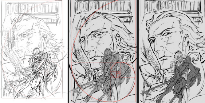
 after scraping/studying from kozaki’s twitter, i made one or two thumbnail doodles below. you can see the solid one had a golden ratio + general line dynamic check squiggled to the side. there’s room for the title, the focus is on corrin, it’ll work both in a horizontal and vertical crop, looking good so far.
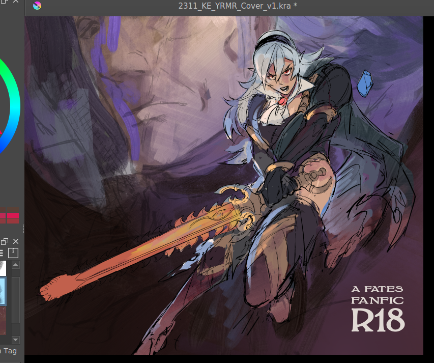
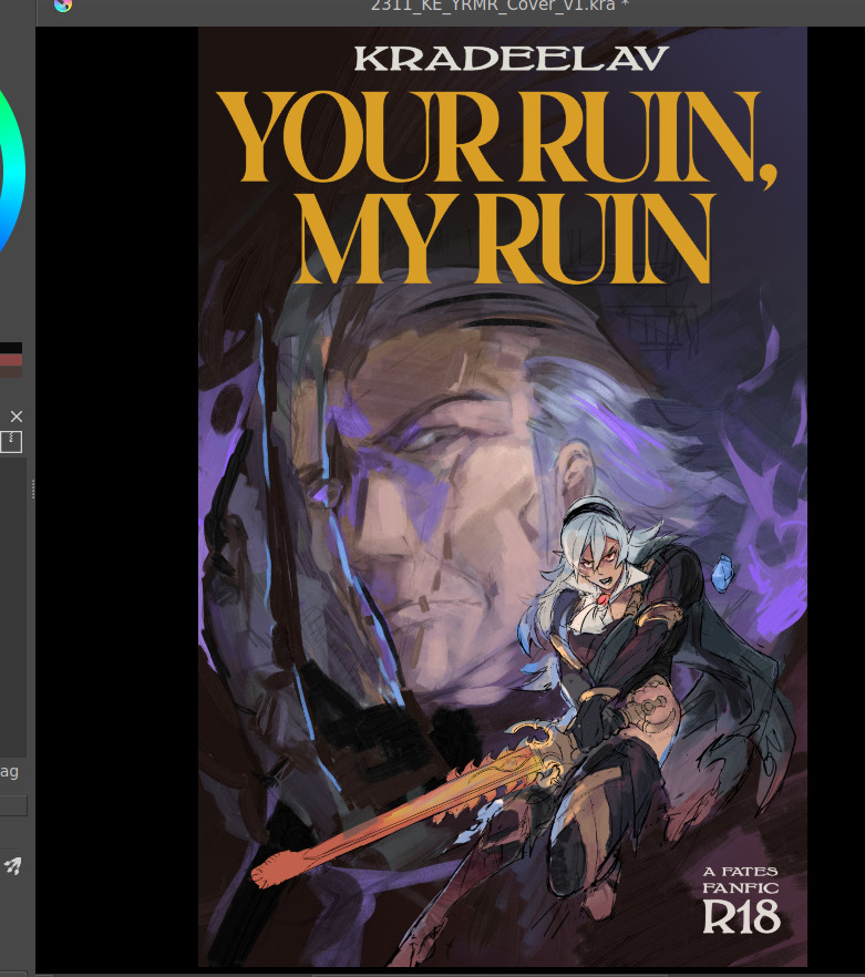
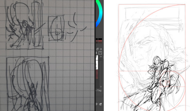 you can see how pretty tightly to the thumbnail i kept, other than moving the vertical text to the top since i didn’t have as much room there. i’m a little worried about the different line quality between how big the face is vs corrin but we’ll see.
something i also realized i like about the composition is corrin “could” look like she’s attacking the viewer, but she also looks like she could be guarding him with her back to him, which…. heh. comes up in some interesting ways in the last third of the fic (possession wise).
bunch of cleaning up.
you can see how pretty tightly to the thumbnail i kept, other than moving the vertical text to the top since i didn’t have as much room there. i’m a little worried about the different line quality between how big the face is vs corrin but we’ll see.
something i also realized i like about the composition is corrin “could” look like she’s attacking the viewer, but she also looks like she could be guarding him with her back to him, which…. heh. comes up in some interesting ways in the last third of the fic (possession wise).
bunch of cleaning up.
 as I suspected since this is 11x17in (much bigger than what i normally draw) i had to grab a different brush for gunter since thin lines were not going to work as they did for corrin. i think kozaki’s real genius is how he treats texture with his linework; where he does thin lines, where he puts the thick ones, etc.
corrin’s coming along great but there’s a spirit to the first face on the left i think i’m missing now, so i’ll probably re-insert that. (also decided to at least draw in his face there even though the masks/slices will distort that). i think what also helps is gunter’s face is very low contrast and needs to remain low contrast, to help corrin pop out in front.
then i started thinking about typography. a lot of the fonts i had were either way too masculine/bland/modern, or way too feminine/curvy. this title needs a hint of masculinity to nod at FE’s general action-adventure RPG roots, but it’s also very distinctly the kind of erotica that doesn’t easily lend itself to a genre. it’s tender horror, it’s daddy kink, it’s vicious romance, it’s … a lot of things.
here’s another thing: when thinking about title typography, another consideration is genre. briefly i considered something like lovecraftian covers; my doujin circle and i had been sharing pictures of old pulp covers. i also noticed a lot of my favorite JP erotic horror doujin have very spiky titles. this title also needs to be scrunched up in a tight space so it’s not like we got a sprawl of acreage here either.
what doesn’t help is enemies to lovers doesn’t really have a visual language in mainstream media.
it’s a staple of Ao3 (written) genres, but the closest you’d get otherwise would be romantic horror (kind of says a lot about who makes what huh?). for example, the shape of water (movie) isn’t a 1:1, but it’s pretty damn close — unfortunately that poster dodged the question by using an art deco-inspired font typeface that was more about the setting than the genre.
and then i had an epiphany. maybe i was approaching this from the wrong direction: it’s the knight/liege romance that’s the heartbeat to YRMR.
think more old dragonlance novels. old medieval/fantasy pulp novels; plenty of kinky sex and ass in there, and still close enough to FE. remember everyone and their mamma having a bi ass crush for bad boy raistlin? that’s the vibe i want.
as I suspected since this is 11x17in (much bigger than what i normally draw) i had to grab a different brush for gunter since thin lines were not going to work as they did for corrin. i think kozaki’s real genius is how he treats texture with his linework; where he does thin lines, where he puts the thick ones, etc.
corrin’s coming along great but there’s a spirit to the first face on the left i think i’m missing now, so i’ll probably re-insert that. (also decided to at least draw in his face there even though the masks/slices will distort that). i think what also helps is gunter’s face is very low contrast and needs to remain low contrast, to help corrin pop out in front.
then i started thinking about typography. a lot of the fonts i had were either way too masculine/bland/modern, or way too feminine/curvy. this title needs a hint of masculinity to nod at FE’s general action-adventure RPG roots, but it’s also very distinctly the kind of erotica that doesn’t easily lend itself to a genre. it’s tender horror, it’s daddy kink, it’s vicious romance, it’s … a lot of things.
here’s another thing: when thinking about title typography, another consideration is genre. briefly i considered something like lovecraftian covers; my doujin circle and i had been sharing pictures of old pulp covers. i also noticed a lot of my favorite JP erotic horror doujin have very spiky titles. this title also needs to be scrunched up in a tight space so it’s not like we got a sprawl of acreage here either.
what doesn’t help is enemies to lovers doesn’t really have a visual language in mainstream media.
it’s a staple of Ao3 (written) genres, but the closest you’d get otherwise would be romantic horror (kind of says a lot about who makes what huh?). for example, the shape of water (movie) isn’t a 1:1, but it’s pretty damn close — unfortunately that poster dodged the question by using an art deco-inspired font typeface that was more about the setting than the genre.
and then i had an epiphany. maybe i was approaching this from the wrong direction: it’s the knight/liege romance that’s the heartbeat to YRMR.
think more old dragonlance novels. old medieval/fantasy pulp novels; plenty of kinky sex and ass in there, and still close enough to FE. remember everyone and their mamma having a bi ass crush for bad boy raistlin? that’s the vibe i want.
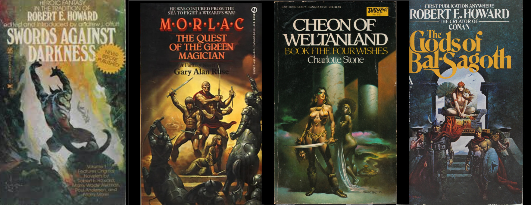 this kind of glorious deranged shit. you’re not gonna be surprised at possessed grandpa whip kink if you read these on the regular.
after ~*arcane designer magic*~ (I do this for a living) bolton and magiona display were the two fonts that were gonna work just fine together.
god that looks so much better. this looks believable now.
this kind of glorious deranged shit. you’re not gonna be surprised at possessed grandpa whip kink if you read these on the regular.
after ~*arcane designer magic*~ (I do this for a living) bolton and magiona display were the two fonts that were gonna work just fine together.
god that looks so much better. this looks believable now.
 the thin/thick line weight contrast in magiona display is going to accentuate the lineart in a way that might be tricky with other fonts that work better on painted covers. bolton’s “squished” vertically enough it doesn’t compete with the other one, and makes for a good secondary/tertiary font.
few other things happened.
i shrunk gunter’s face because not being able to see his jawline (sex appeal u see) was bothering me from a composition standpoint. it’s the same reason frank frazetta didn’t censor his glorious asses.
(said seriously, by the way. so many people don’t give their lust in art enough credit.)
i also needed more room for the title to show, and the line quality/scale difference between his face was also bugging me. does this mess up the golden ratio composition? sure, temporarily, but his armor’s weirdly flexible that we can adapt it pretty easily.
it’s about this time i’m also looking through my hydrus network stash of favorite covers for what color palette and contrast to use. kozaki tends to skew purple/cooler hues for nohr characters, and that’d go well with these two.
purple/green hues that play well with light purple and the yellow from those old covers i love so much, low contrast midground, and something that’d contrast well with text above. dark/black background for the gothic vibes, and the text will probably need to be white or some sort of light-warm hue for that “pop”.
doing color tests is more of a leap of faith and intuition than an exact science, but damn it is it satisfying when you nail it in one go and go ‘holy shit i want to read this. 😀
the thin/thick line weight contrast in magiona display is going to accentuate the lineart in a way that might be tricky with other fonts that work better on painted covers. bolton’s “squished” vertically enough it doesn’t compete with the other one, and makes for a good secondary/tertiary font.
few other things happened.
i shrunk gunter’s face because not being able to see his jawline (sex appeal u see) was bothering me from a composition standpoint. it’s the same reason frank frazetta didn’t censor his glorious asses.
(said seriously, by the way. so many people don’t give their lust in art enough credit.)
i also needed more room for the title to show, and the line quality/scale difference between his face was also bugging me. does this mess up the golden ratio composition? sure, temporarily, but his armor’s weirdly flexible that we can adapt it pretty easily.
it’s about this time i’m also looking through my hydrus network stash of favorite covers for what color palette and contrast to use. kozaki tends to skew purple/cooler hues for nohr characters, and that’d go well with these two.
purple/green hues that play well with light purple and the yellow from those old covers i love so much, low contrast midground, and something that’d contrast well with text above. dark/black background for the gothic vibes, and the text will probably need to be white or some sort of light-warm hue for that “pop”.
doing color tests is more of a leap of faith and intuition than an exact science, but damn it is it satisfying when you nail it in one go and go ‘holy shit i want to read this. 😀
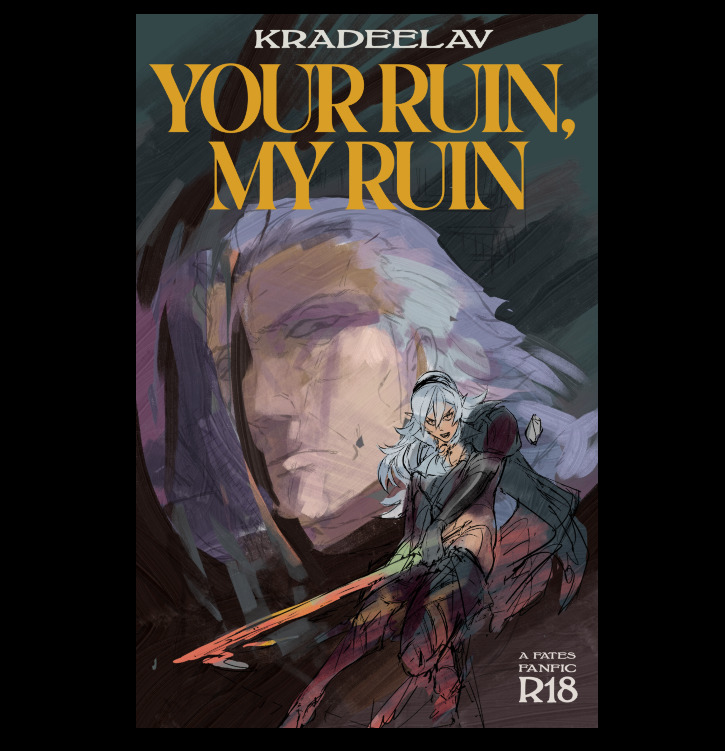 (green/gold for the hint of anankos’ mask, also matching the yato and her warmer skin tone. purple flames for him, but the high contrast armor to separate her from his larger shapes. we’ve got the dragonstone and the yato as flexibility for lighting and emphasizing contrast with her. )
i kind of like how i accidentally made the mask shards reflect(?) a bit of his own face. hell yeah throw it in. this is something that’s more likely to work than not. this is something that has that mix of id and horror i’ve been going after.
here’s another version with references to the side and the golden ratio laid on again.
(green/gold for the hint of anankos’ mask, also matching the yato and her warmer skin tone. purple flames for him, but the high contrast armor to separate her from his larger shapes. we’ve got the dragonstone and the yato as flexibility for lighting and emphasizing contrast with her. )
i kind of like how i accidentally made the mask shards reflect(?) a bit of his own face. hell yeah throw it in. this is something that’s more likely to work than not. this is something that has that mix of id and horror i’ve been going after.
here’s another version with references to the side and the golden ratio laid on again.
 honestly a lot of it at this step is going ‘dude you know what would be SO DOPE…. PURPLE FIRE…’ ‘dude….. fuck yes….’ ‘what about some sick ass sword effects?’ ‘YEAH….’ and saving a bunch of backups in case of the idea didn’t work out.
(am i going so much harder on a literal gilf porn fanfic cover than i need to? hell yeah. gunterfuckers deserve better. 😀 )
anyway here is when i start questioning everything, so i’ll take a break from the colors to tighten up the lineart. now that the composition’s settling in much tighter, i’m also thinking about how the two shapes interact with each other and if there’s any potential issues with tangent points (where two lines intersect each other in a way that makes an optical illusion.)
honestly a lot of it at this step is going ‘dude you know what would be SO DOPE…. PURPLE FIRE…’ ‘dude….. fuck yes….’ ‘what about some sick ass sword effects?’ ‘YEAH….’ and saving a bunch of backups in case of the idea didn’t work out.
(am i going so much harder on a literal gilf porn fanfic cover than i need to? hell yeah. gunterfuckers deserve better. 😀 )
anyway here is when i start questioning everything, so i’ll take a break from the colors to tighten up the lineart. now that the composition’s settling in much tighter, i’m also thinking about how the two shapes interact with each other and if there’s any potential issues with tangent points (where two lines intersect each other in a way that makes an optical illusion.)
 that said i love how his jawline “points” at her face, that kind of line you want.
grinding away on corrin’s lineart. also double checking that the shapes/colors/forms for her “make sense” both standalone and with the composition too. what’s nice is she’s at the point where i can just turn off my brain and polish up.
naturally couldn’t resist poking at it more and this is when the rest of it clicked after figuring out which bit was anankos’ mask, which bit was possessed!gunter vs himself (polished up the armor a bit too. at this point i’m pretty confident that it’ll stay “set”; the biggest thing i’m likely to change is the blue silhouette to the dragonstone side for corrin.
that said i love how his jawline “points” at her face, that kind of line you want.
grinding away on corrin’s lineart. also double checking that the shapes/colors/forms for her “make sense” both standalone and with the composition too. what’s nice is she’s at the point where i can just turn off my brain and polish up.
naturally couldn’t resist poking at it more and this is when the rest of it clicked after figuring out which bit was anankos’ mask, which bit was possessed!gunter vs himself (polished up the armor a bit too. at this point i’m pretty confident that it’ll stay “set”; the biggest thing i’m likely to change is the blue silhouette to the dragonstone side for corrin.
 thanks for reading. 😀