(In reply to a message originally on tumblr. A nice soul sent an inquiry about any tips drawing old men I’ve learned recently; here’s a few insights that may or may not be helpful. -krad)

You’ve probably already seen my post on drawing old folks in general, but just in case if you haven’t, it’s over here. I link it mostly because there’s a book mentioned there (Morpho: Skin & Fat) that is a far better resource than anything I could mention; it talks about how gravity affects sags over time and wrinkle placement—all that good stuff.

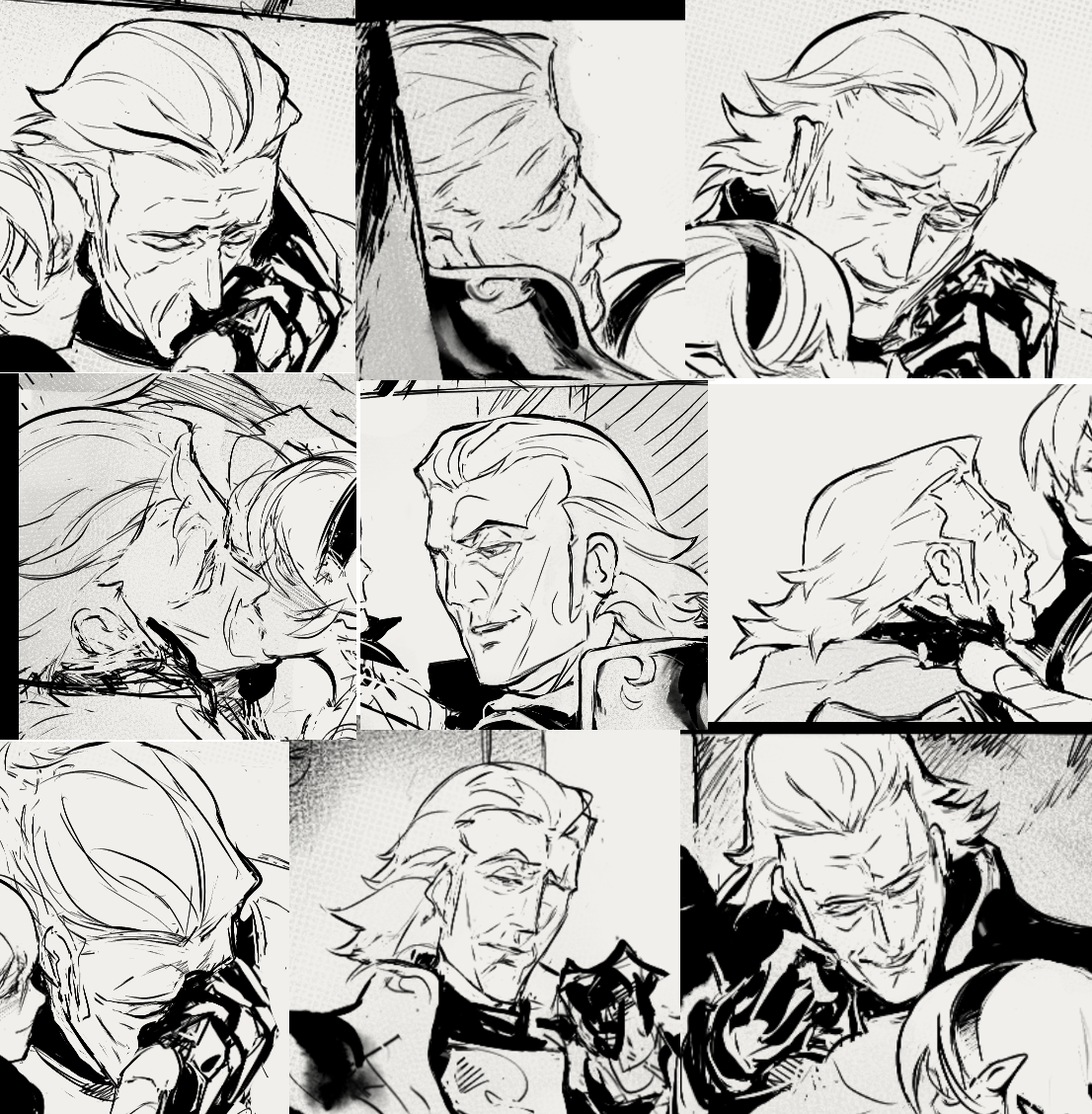
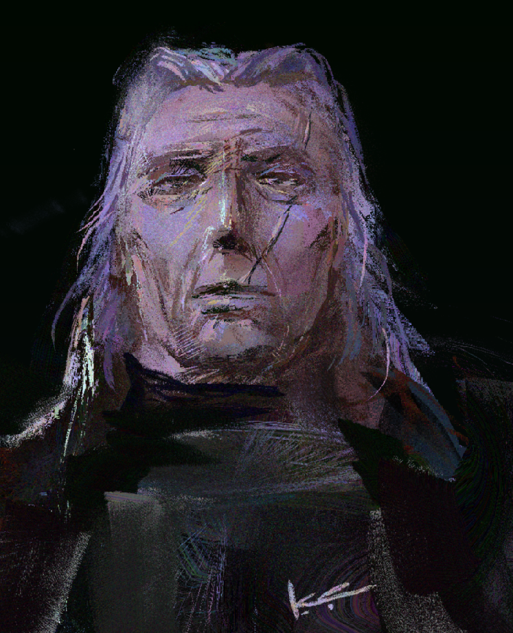
I will say, what has been useful to learn recently is that it’s very possible to over-render age lines, and that “more lines” doesn’t always mean better.

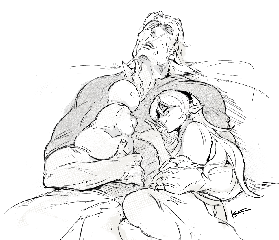
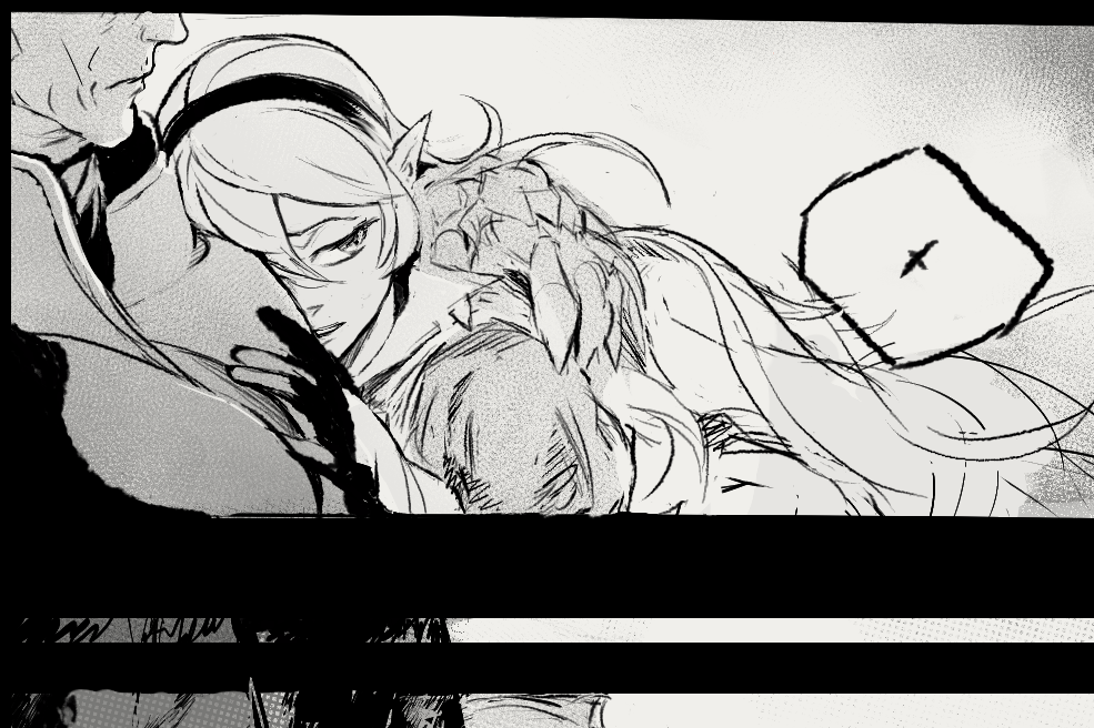
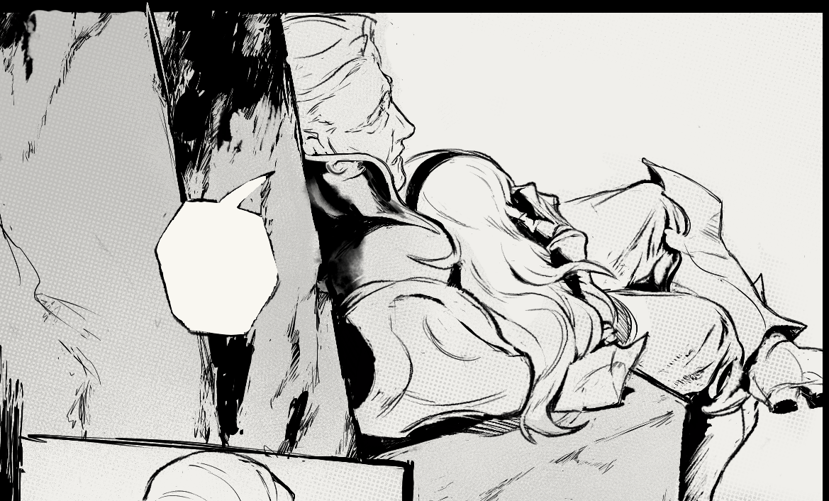
Sure, we’re probably sick and tired of the standard gacha-style “two lines by the eyes and mouth” stylization and how it doesn’t cut it when you want a believable 60+yr old. But there’s also the other extreme of drawing too many lines/creases where the clarity (emotional clarity, visual clarity, character design clarity) of the art piece gets lost. Sometimes one well placed crease/shadow can believably (and handsomely) age a person more than five of them.

That’s when you get into the interesting game of ‘knowing how to draw all the creases/wrinkles so you don’t over- or under-shoot the number of lines’ for clarity. It’s a fun tug-of-war between placing the lines for the specific expression, placing them for Teh Sexy (if you are drawing them for fanservice) vs placing them for that specific character.

Lastly, it’s fun to collect stylized versions of old folks and see what shortcuts do work for other illustrators. I don’t have the tumblr post on me right as of the moment, but there’s one floating around that mentions Urasawa’s various manga/anime series is a great example of the sheer variety, and there’s other creators too. For example —

Image
Image
Image
Image

Same medium, four different dudes (still could be more variety!), but four vastly different line placements that are still flexible enough to show believable but consistent acting.

Hope that helps ~

notes on drawing old people:

  • morpho’s skin + fat book is an invaluable reader for an easily-digested anatomy study. here’s that book plus a few others. please support the author if you can.
  • like other naturalistic carbon life forms in nature, lines don’t have to be perfect. (personally i find tiktok-standard young people the hardest ones to draw because if you draw a line with the eye a smidge off, it looks weird. old people, you got a lot of forgiveness in them lines. hell, multiple lines just look good as wrinkles.)
  • fleshy things sag, and they always sag towards gravity (down). if you had to pick three major areas to draw, the bit under people’s chin, the tits (unisex), and the belly are generally the main three.
  • a cluster of wrinkles tend to pop up in joints that bend a lot, notably knuckles, elbows, and knees. those same joints have a habit of enlarging, whether due to inflammation, or the surrounding muscle wasting away a bit.
  • you move real slowly and your range of motion is a lot more limited because joints hurt in particular. (aka your hands/elbows/neck/shoulders can’t reach shit they used to.) old people’ll often have canes/back-scratchers/etc discretely within range to help with this, to almost act as a limb-extender.
  • with necks in particular, you tend to move your whole upper body in one piece rather than your neck twisting independently from the shoulders.
  • … and you really don’t want to fall, and maybe your eyesight’s going too. so you’re always double checking whether or not your surroundings are stable. old people sit down gingerly (hands might grasp a table or railing several times for the best position), and gravity is not your friend getting up either.
  • backs tend to hunch over and stay in the bent position. because of this, and the muscles wasting a way, old people often tend to look like they “shrink” slightly versus an adult in their prime. a notable exception is people who’ve had military training, and the difference is striking.
  • lastly, when in doubt, watch some videos of some old people even just for a few seconds, and mentally sketch out how you’d draw the freeze-frames. which bits move, and which bits stay stationary?

you all, i was sleeping on heavypaint holy shit

i have no idea what i’m doing here but it is whack ass fun

it’s not for everyone (it’s not very precise, is the biggest negative) – but the best way i can describe it is like …. if you intellectually know all of those painting “rules” (3 color rule for faces, soft/hard edges, cools vs warms, james gurney types of tips, and for the elder internet folks – conceptart.org threads, etc) – but have never been able to actually. Put It Into Practice with photoshop – this is the program that actually emulates physical painting at its best, weirdly enough. it forces you to think in shapes + color way better than any other digital program i’ve touched in 20 years of digipainting.

part of my new year’s resolution for 2024 is to experiment more across different mediums/methods/styles, and I really want to spend a long good while in heavypaint which feels like it has a lot of underused potential there.

did a little chart of all the brushes in heavypaint i have on “speed dial” in b/w so i can see what the options are at a glance.  thinking about playing with it with just b/w for a month or two as a temporary limitation to get a feel for the textures before introducing color. you could probably do some sick manga paneling and inking with this.